Client
WunderDerm · Augsburg, Germany
Industry
Beauty and wellness · local services
Scope
Brand direction → UX/UI → Next.js + Sanity → migration
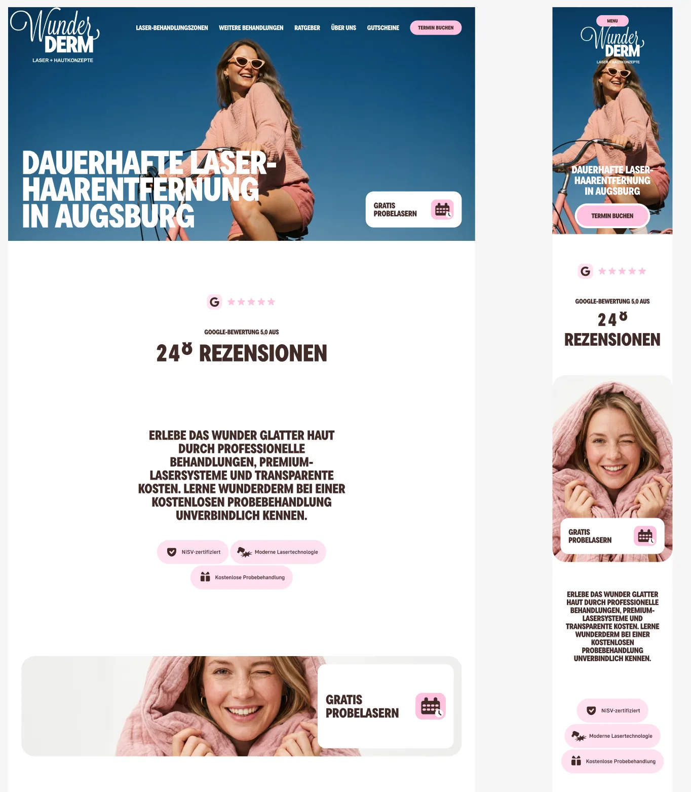
Modernising a familiar brand without flattening its character
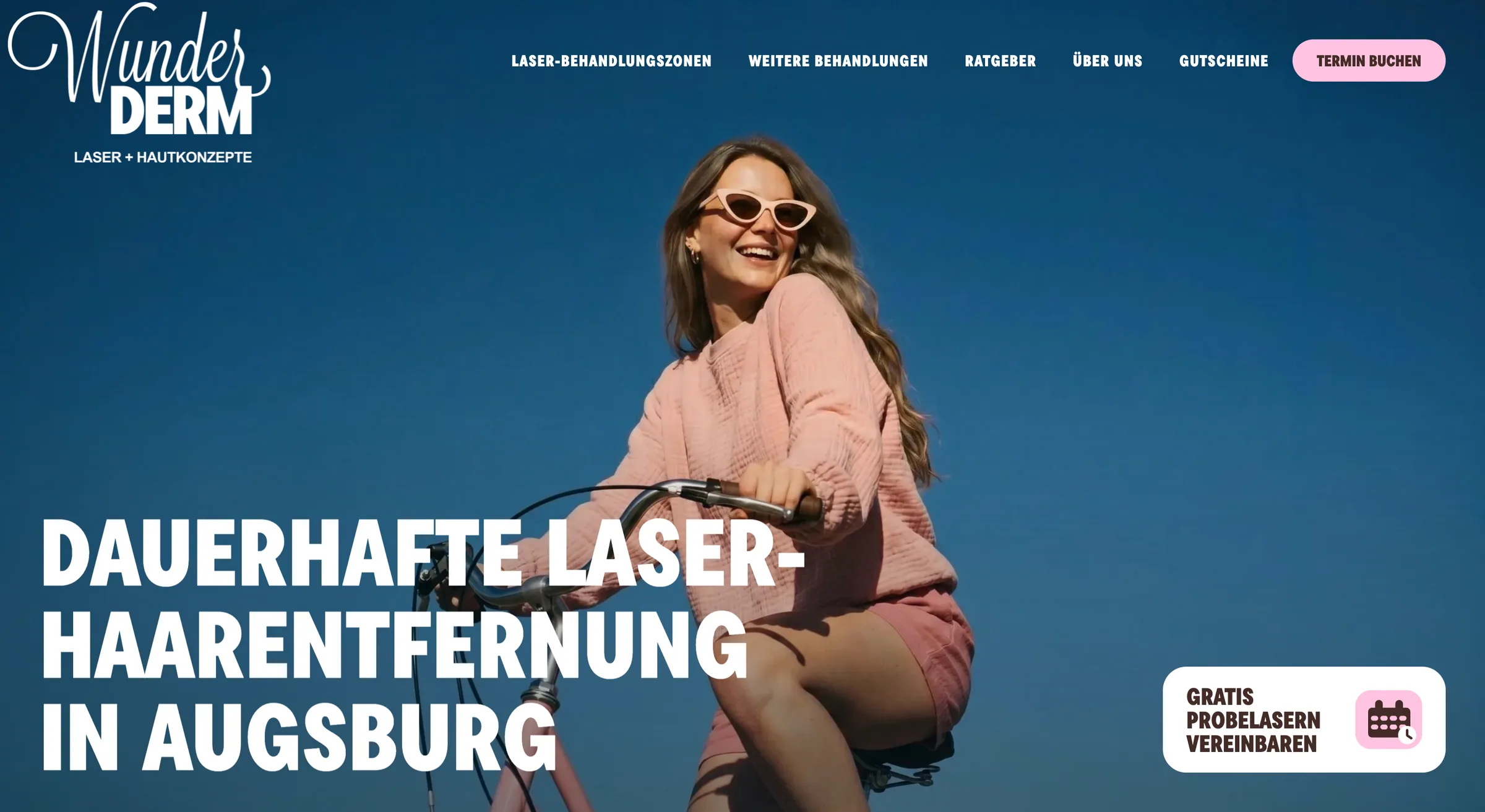
WunderDerm already had recognition, clients and a distinctive name. The goal was to preserve that equity while moving beyond the earlier beauty-laboratory aesthetic and clarifying the positioning around “Laser + Hautkonzepte.”
The legacy WordPress site had accumulated services, price information and technology explanations in separate structures. We reorganised them as one navigable system built around the questions people actually bring to the site.
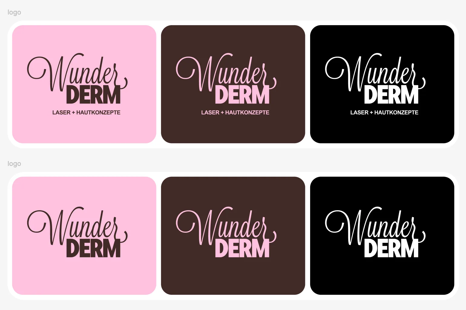
A visual system with personality and practical range
The wordmark remained the expressive anchor. Deep blue, warm brown, vivid pink and off-white then created a flexible hierarchy for editorial pages, service cards, navigation and booking moments.
- Refined logo lockups and positioning line
- Reusable type, colour, spacing and component rules
- Photography direction with warmth and movement
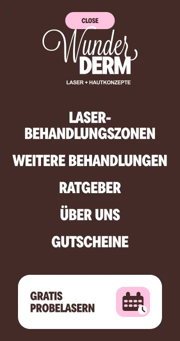
- Desktop and mobile designed as one system
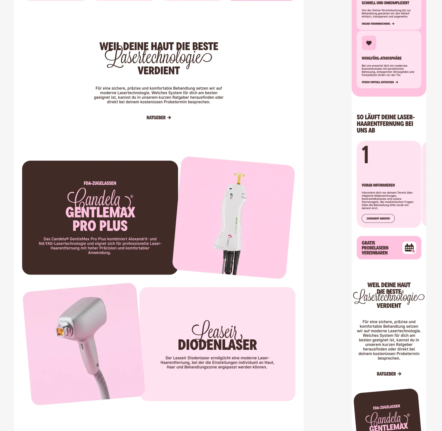
Turning a dense service catalogue into clear journeys
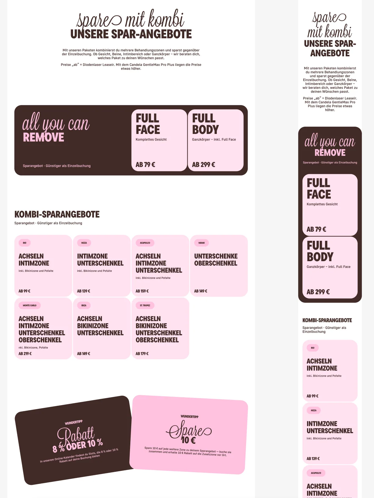
Visitors may start with a treatment area, a budget or a technology question. The new structure connects body-zone navigation, service cards, packages, contextual explanations and booking handoffs instead of treating each page as an isolated campaign.
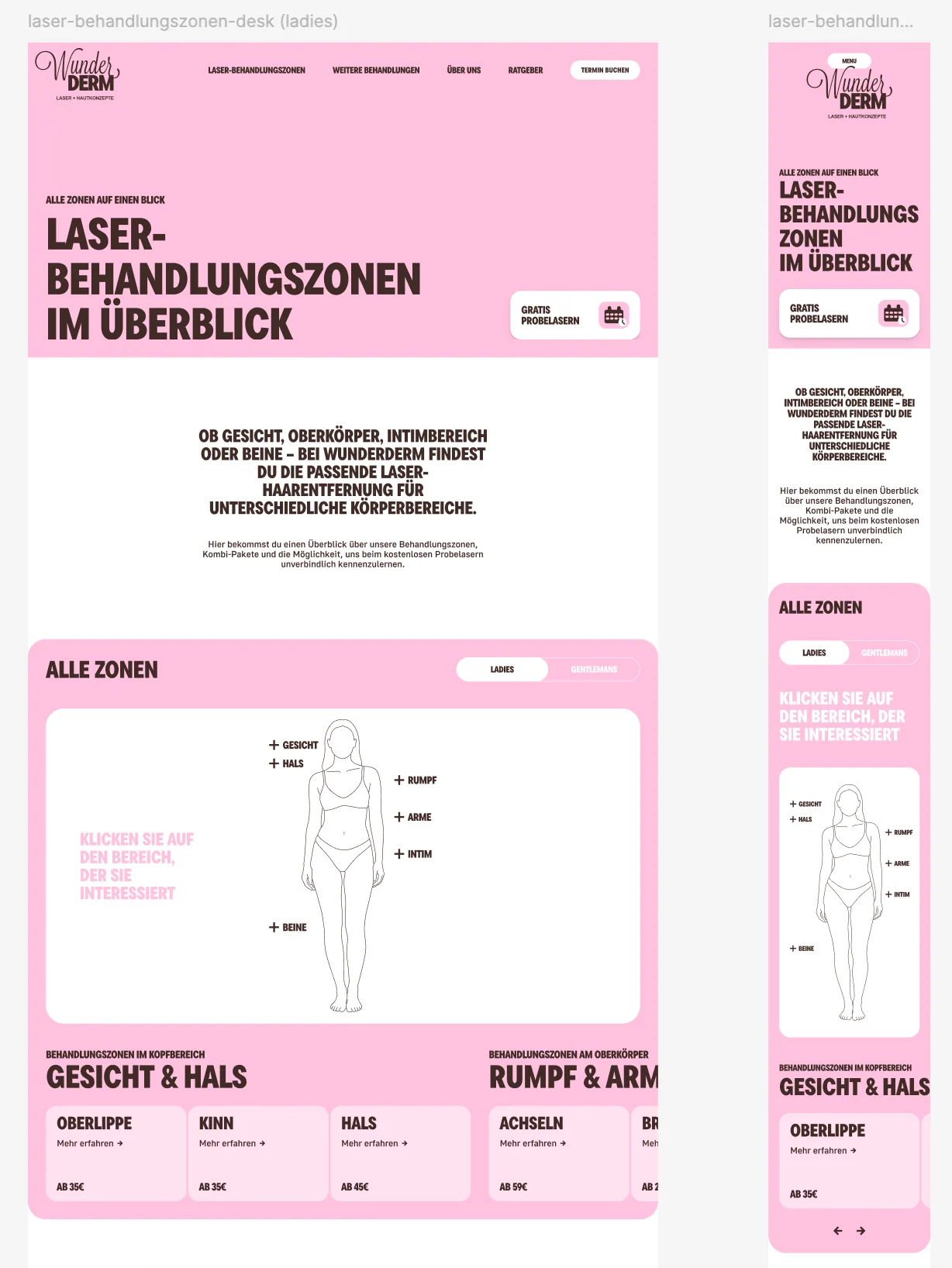
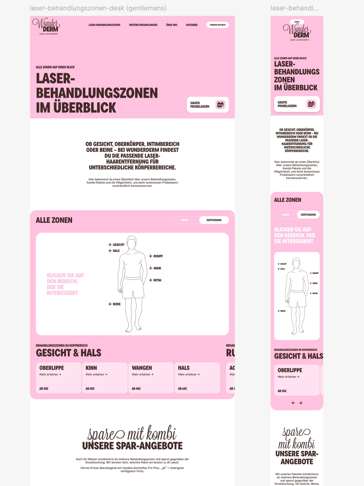
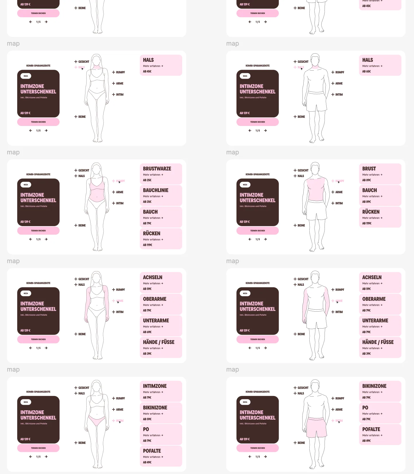
Interactive treatment-zone navigation
The responsive body map lets people switch views, choose a region and reach the relevant zones without scanning an undifferentiated price list. The same content model supports focused pages and compact mobile cards.
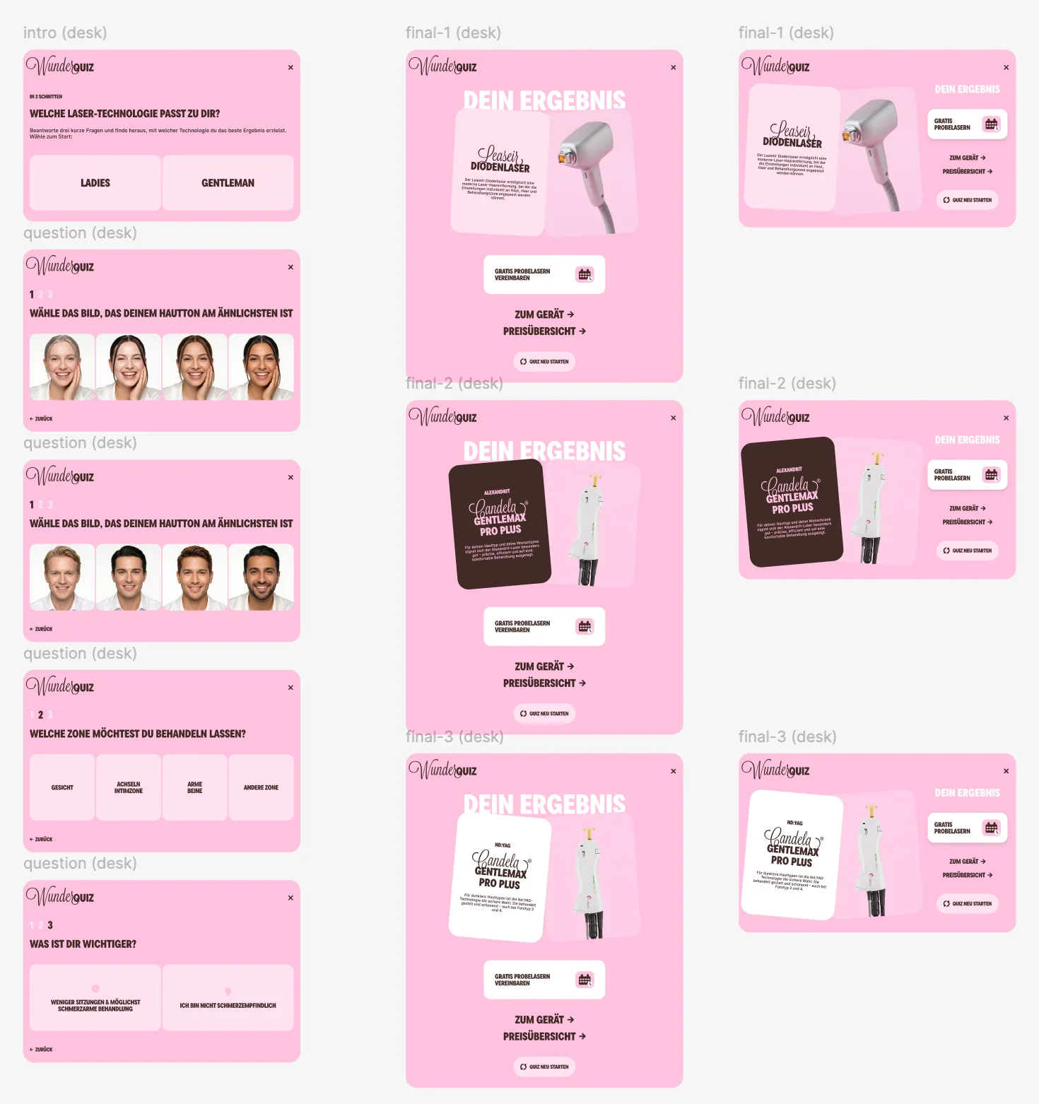
Guidance without presenting a diagnosis
WunderQuiz reduces a technical comparison to a short orientation flow. It points towards relevant product information and pricing while keeping professional consultation clearly separate.
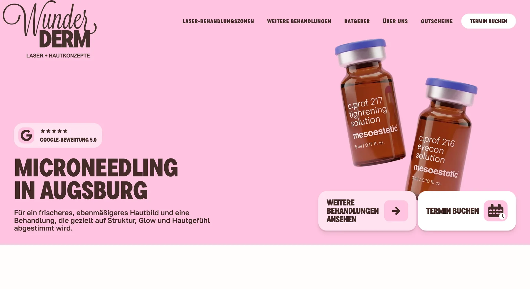
A more editorial service page inside the same system
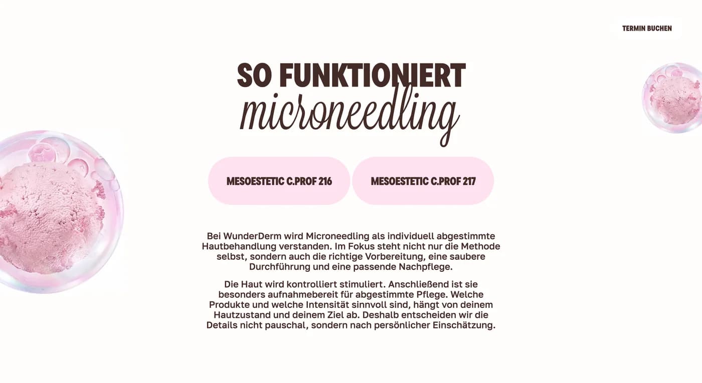
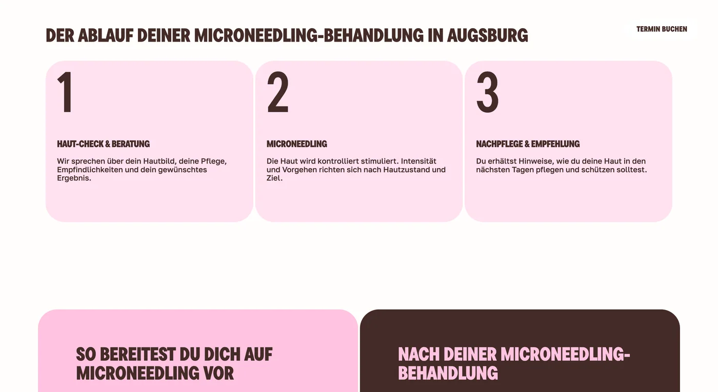
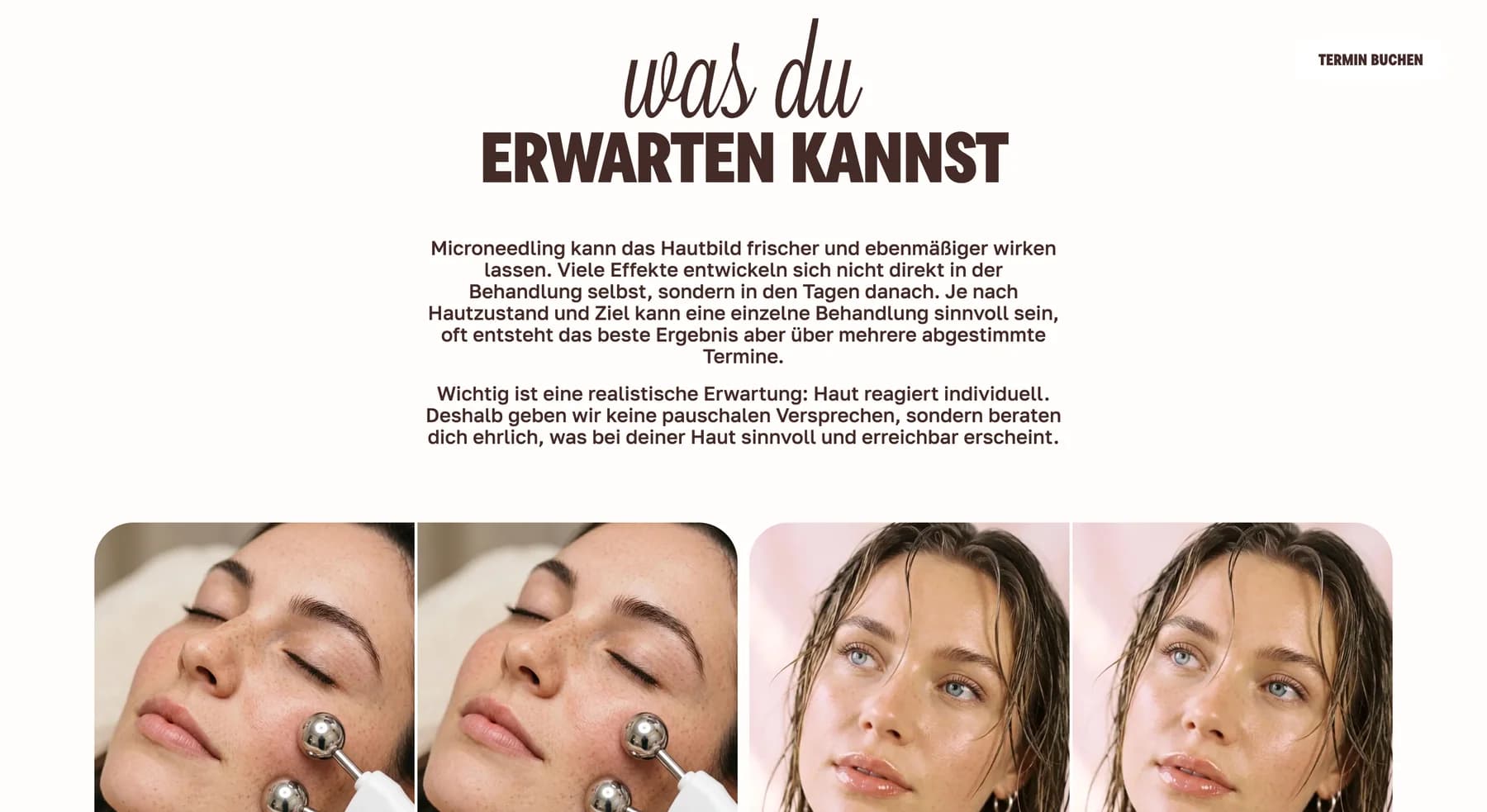
Microneedling required a different rhythm from laser services: product-led imagery, paced explanation, process and practical preparation content. Shared typography, navigation and conversion patterns keep the experience recognisably WunderDerm.
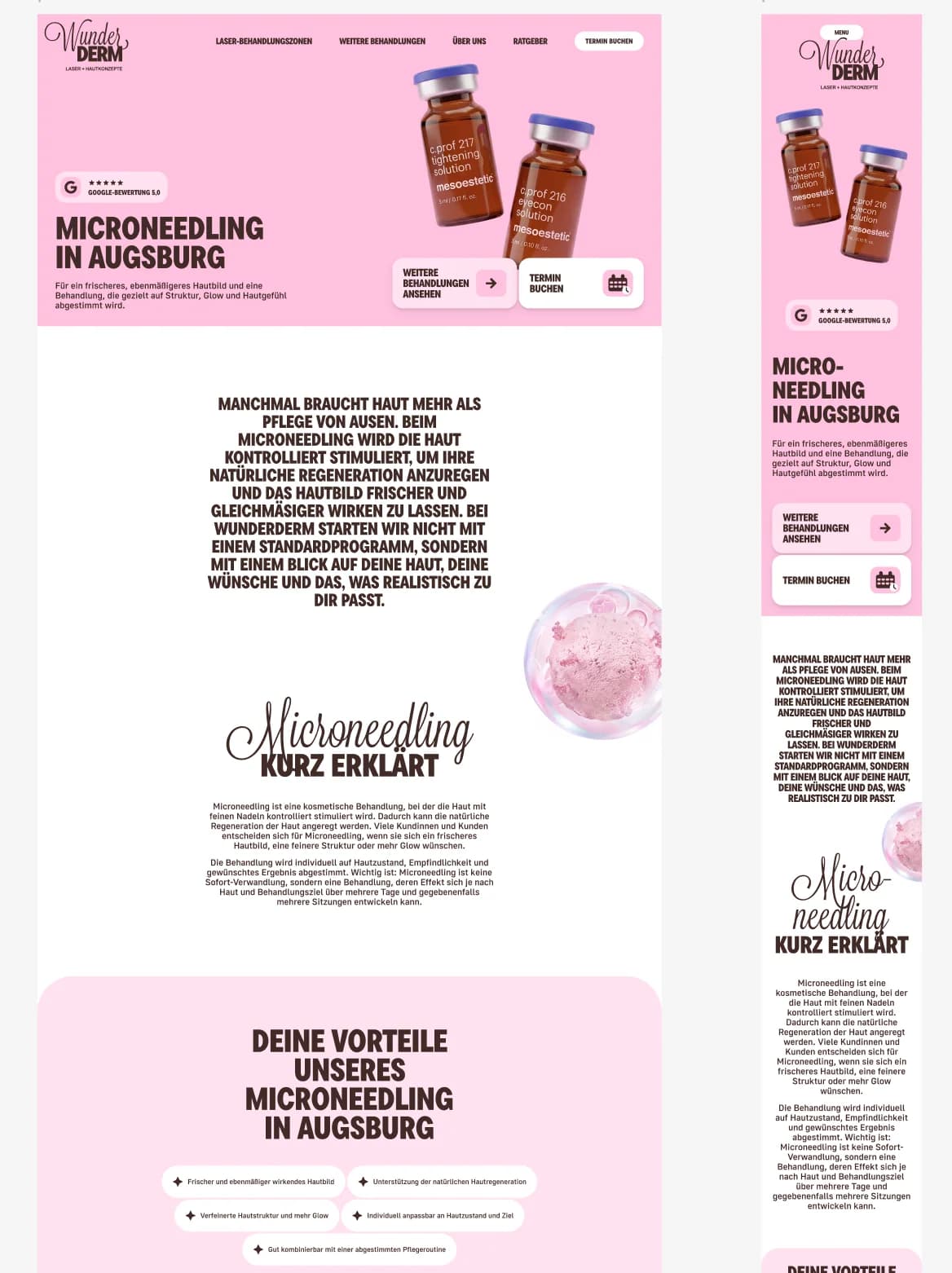
One narrative across Figma, desktop and mobile
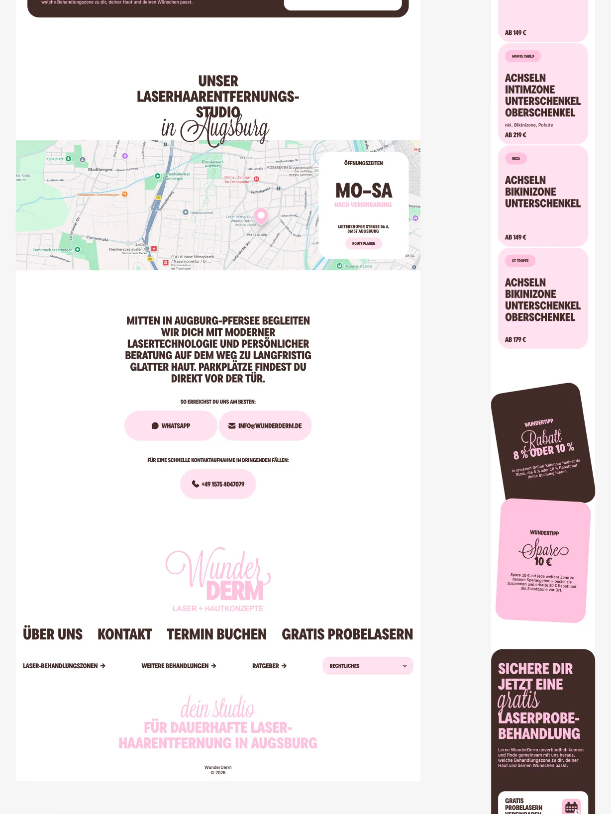
The compositions were developed together across breakpoints. These page captures show how an offer-led opening moves into explanation, process and photography without becoming a disconnected microsite.
A maintainable product foundation behind the redesign
The experience was rebuilt as a Next.js application rather than another page-builder theme. React and TypeScript provide the interface foundation, while Sanity gives the team structured control over content that should evolve without engineering work.
Editorial control
Structured models for core pages, services, articles, FAQs and reusable sections.
Migration discipline
Metadata, structured data, sitemaps and redirects reduce relaunch risk.
Responsive consistency
Shared tokens and components keep every service journey in one visual language.
Ongoing maintainability
Automated checks and typed implementation support safer handover and iteration.
Outcome
The business now has one coherent system spanning brand expression, service discovery, pricing, guided orientation, booking paths and editorial operations — recognisably WunderDerm, but clearer and easier to extend.
This case documents brand, interface and software delivery. It does not make claims about clinical efficacy or individual treatment outcomes.
Modernise an established service brand without starting from zero
We connect strategy, responsive design, CMS architecture, migration and engineering in one accountable relaunch.
More from the design system