Product
AERA · digital product studio
Focus
Positioning · capabilities · work · inquiries
Delivery
Brand system → UX/UI → responsive website
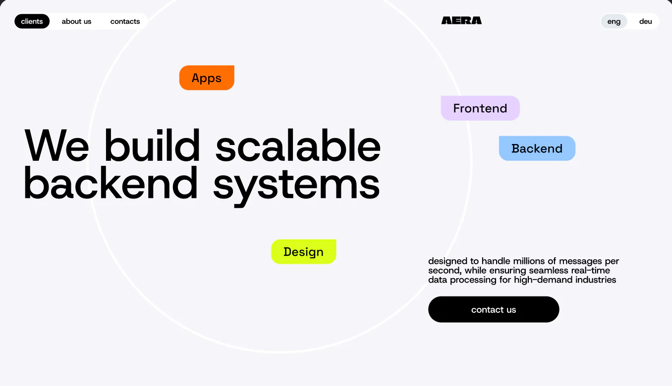
A broad offer needs a clear route through it
AERA brings backend engineering, web and mobile delivery, product design, DevOps and integration work into one studio. The design challenge was not to add more capability claims, but to help a buyer understand how those disciplines connect and when each one matters.
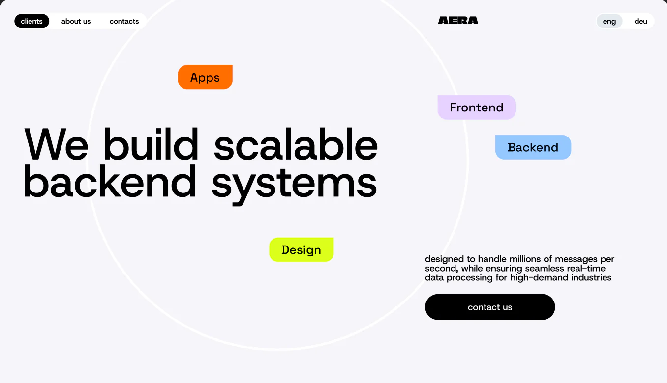
The site therefore behaves as a product. The homepage frames the promise, capability pages add useful depth, the work archive supplies evidence, and team and contact pages resolve the questions that usually precede a serious conversation.
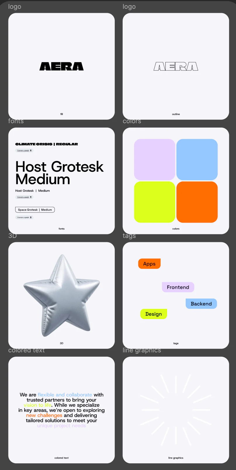
An identity designed to behave consistently
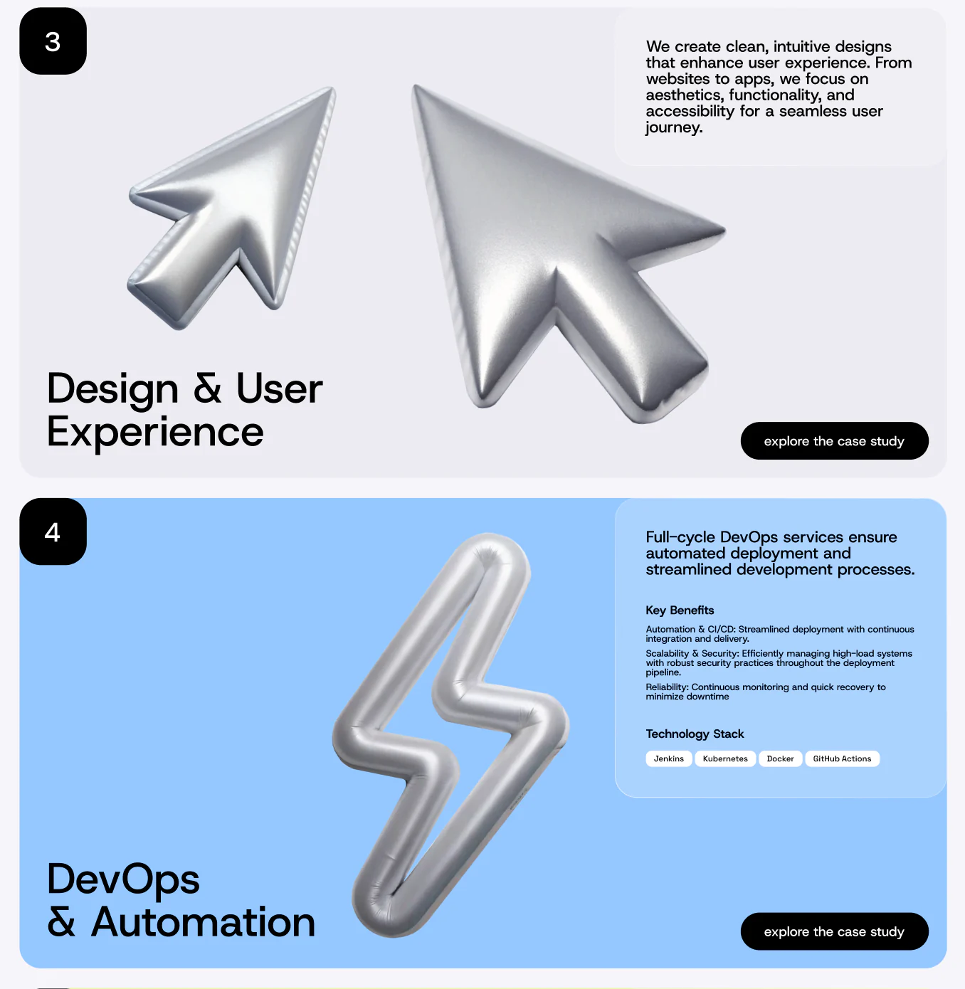
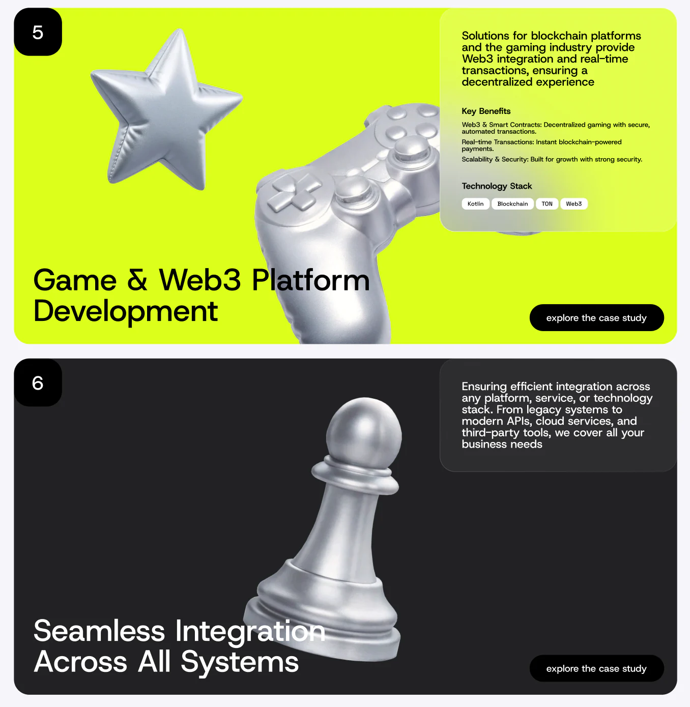
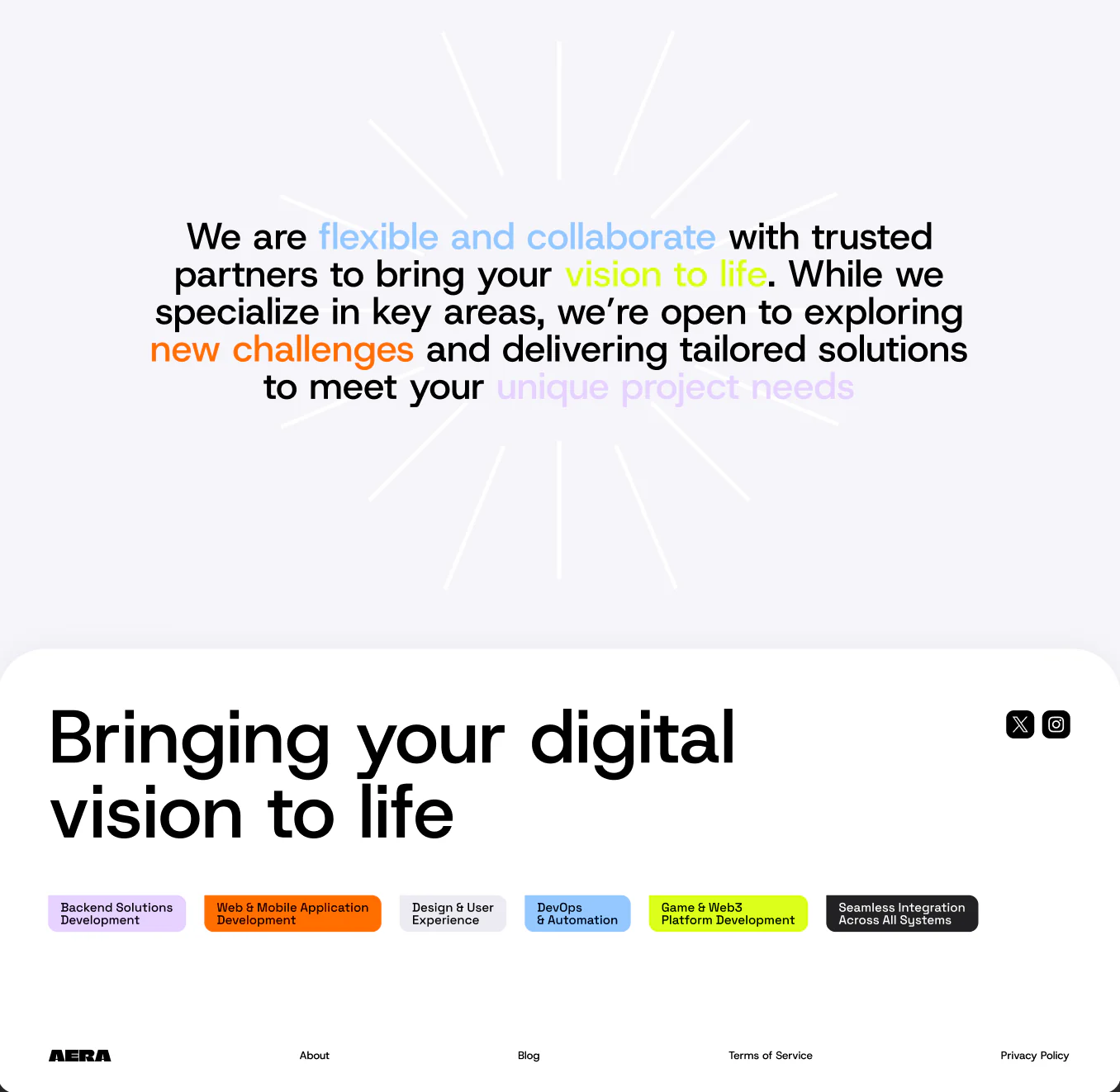
The wordmark, oversized typography, silver 3D objects and four accent colours form a working interface language. They organise hierarchy, service tags, highlighted claims and transitions through dense technical content.
- Filled and outlined wordmarks for light surfaces
- One type hierarchy across marketing, cases and UI labels
- Capability colours that continue through cards and detail pages
- A reusable 3D family instead of one repeated hero device

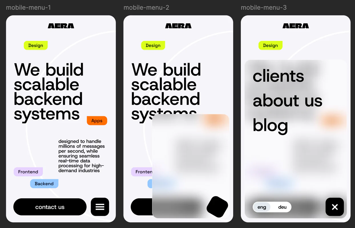
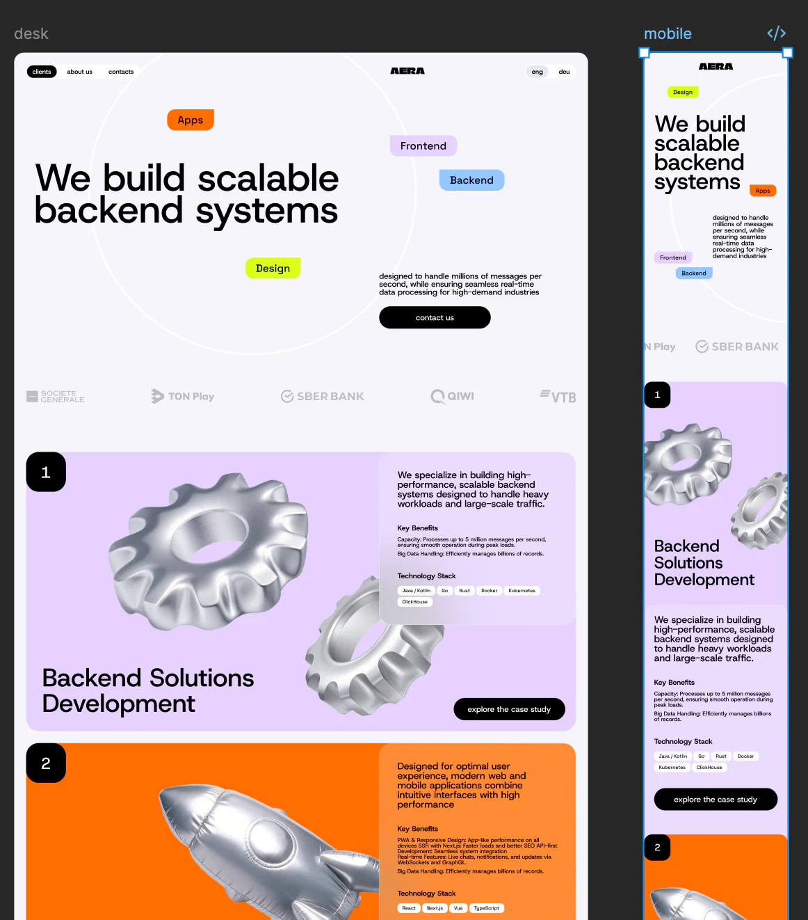
Responsiveness was addressed through content priority
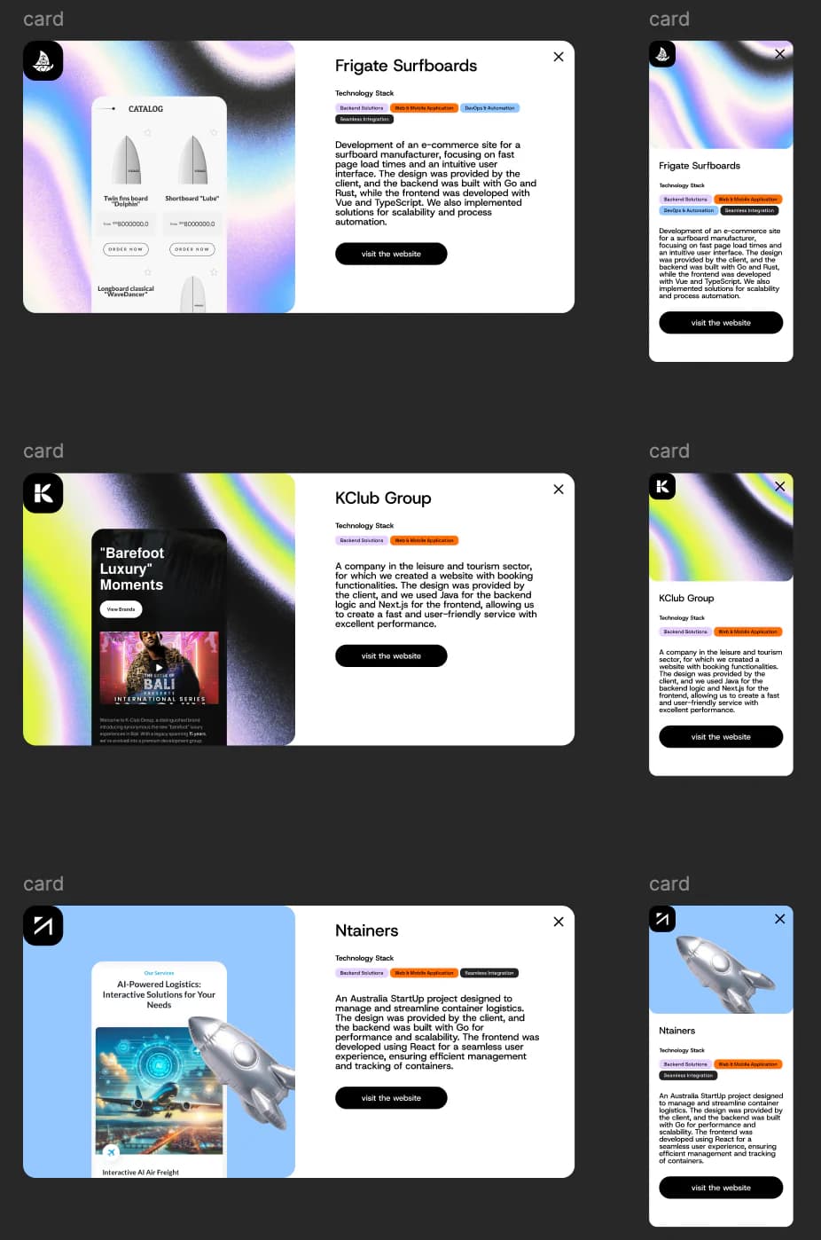
The mobile experience is not a scaled-down desktop canvas. Headline rhythm, tag placement, copy density and navigation states were resolved across both breakpoints, preserving the same voice while making smaller screens direct and tactile.
One architecture, six distinct capability narratives
Every capability page answers the same commercial questions: what is delivered, why it matters, which technologies are relevant and where a prospect can see related work. The grid provides consistency while colour, object scale and composition give each discipline its own character.

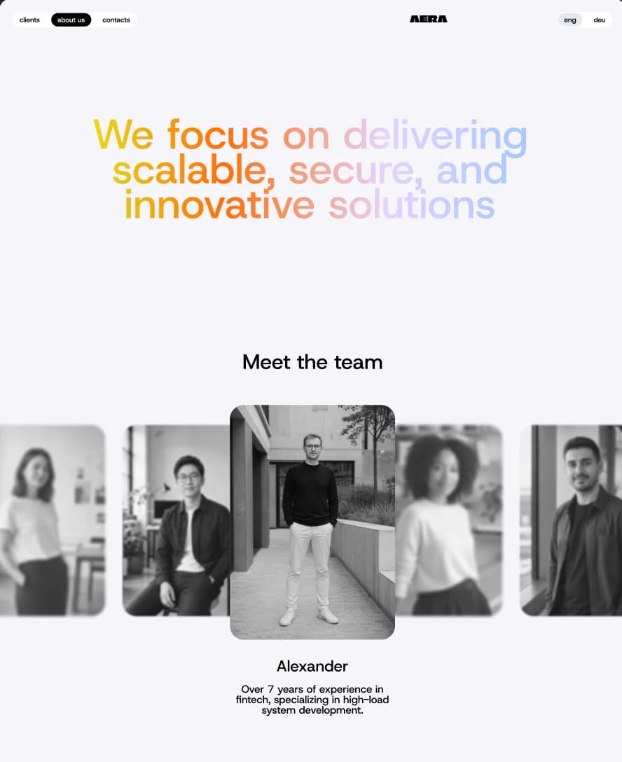
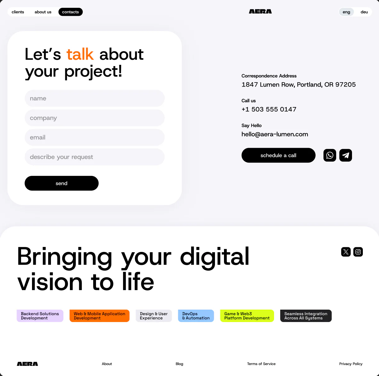
Trust needs people, process and an easy next move
The team page combines a clear point of view with editorial portraits rather than a corporate directory. Contact separates a concise written inquiry from scheduling, keeping both paths visible without turning the page into administrative clutter.
A proof layer built for ongoing publishing
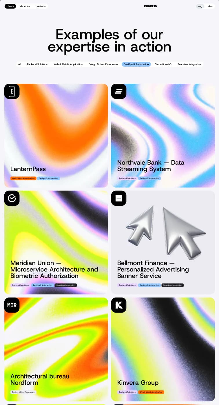
The work archive uses filters, consistent stack labels and distinct case covers. Detail cards retain their information order across desktop and mobile, allowing the portfolio to grow without redesigning the publishing system for every new project.
Outcome: one coherent digital presence
AERA now has a production website system connecting identity, positioning, capabilities, people, project evidence and inquiry routes. Its visual language is memorable, while the underlying information model remains disciplined enough for future services and cases.
Clear commercial narrative
Homepage, capability pages and proof archive each support a distinct stage of evaluation.
Reusable visual system
Type, colour, tags, 3D objects and cards create variety without losing consistency.
Responsive by design
Desktop and mobile preserve intent rather than relying on mechanical scaling.
Ready to keep publishing
New capabilities, people and cases fit a stable information architecture.
Make complex technical work easier to understand
We connect positioning, responsive design and frontend delivery in websites that can explain a serious offer and keep growing with it.